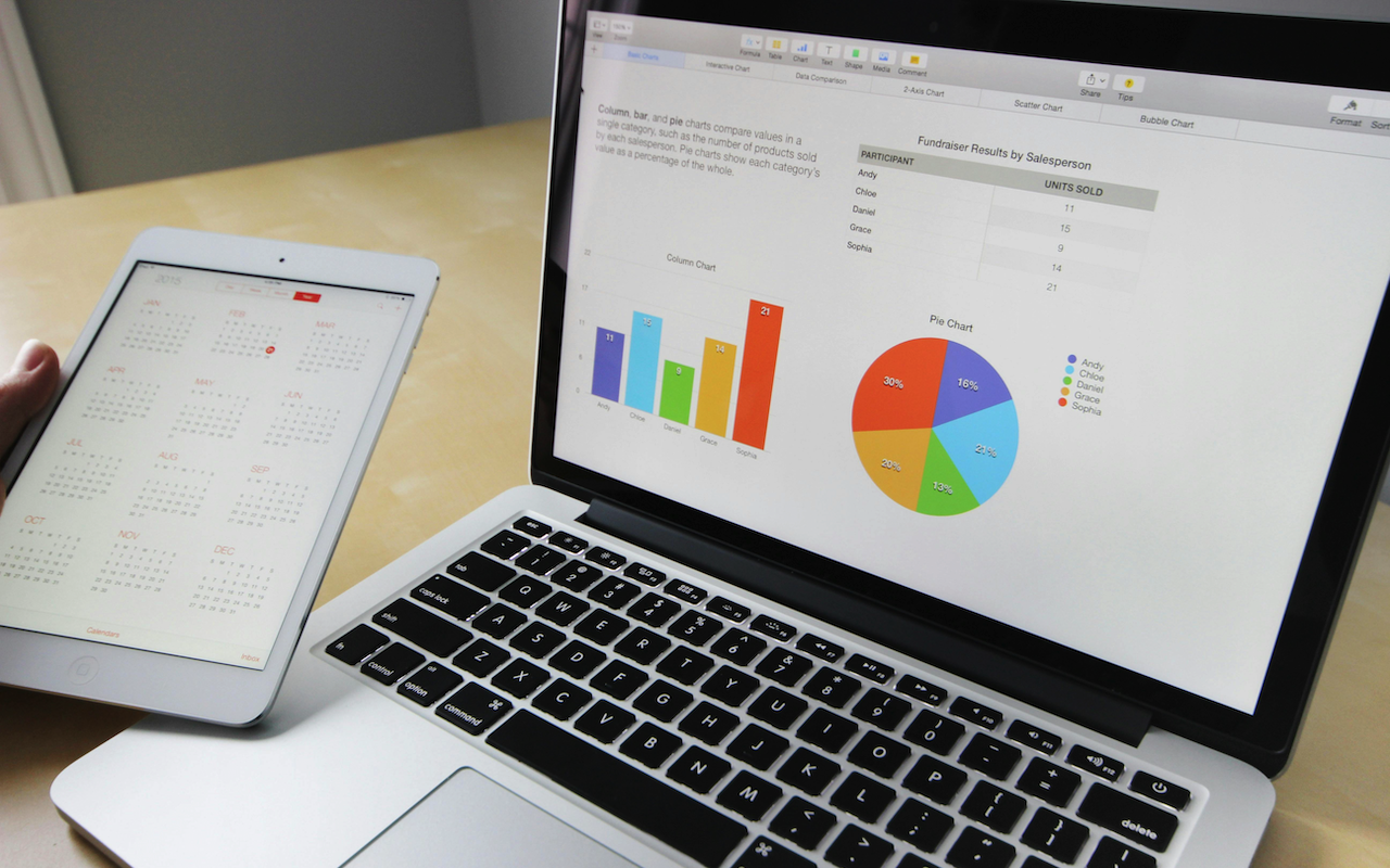
Data is all around you, everywhere you look. But can you make it tell a story? Data visualization can turn raw numbers into a story. Today's information age content creation is all about how well you present data. This article discusses how data visualization can make your content more accessible.
Data by itself can be overwhelming. Spreadsheets of numbers fail to grab attention or cause comprehension. Here comes data visualization. Turning data into charts, graphs or other visual forms lets you identify trends and patterns to communicate complex information in a way that your audience will understand.
Tailoring Your Message with Different Charts
Imagine presenting website traffic statistics as a long report. Nobody would read that, right? Now, plot that data in a line chart that tracks daily visitors over a month and folks people get interested. Seasonal trends and peak traffic times become apparent, providing valuable user behavior insights. This visual representation makes data comprehension easier and your content memorable.
Your choice of chart type matters in all of this. The experts at Excelkits know this and provide the tools and templates you need. For instance, line charts show trends over time. Imagine tracking social media engagement metrics with a line chart, showing growth or decline in followers and interactions.
Bar charts, however, are best for comparing data points across categories. You might be analyzing customer demographics. Graphing customer distribution by age group, location, or gender using a bar chart would be useful. This visual comparison helps you understand your audience composition quickly.
For showing how parts contribute to a whole, pie charts or stacked bar charts are handy. For example, you present website traffic sources. A pie chart could visually represent the percentage of visitors from organic search, social media referrals, or direct traffic.
Visualizing Geolocation and Other Data
Making compelling charts doesn't need to be a manual process any longer. Even though tools like Excel and Google Sheets allow basic charting, dedicated line chart tools offer significant speed, design and ease of use advantages. Those specialized tools are invaluable for professionals who frequently work with data and need quickly accessible charts. They automate chart creation so you can spend more time on analysis than formatting.
Data visualization is an extremely important topic in IP geolocation and internet security. Visualise IP address locations on a world map. You can then easily spot concentrations of traffic from certain regions, which are useful for analyzing web traffic or detecting possible cyber threats from certain regions.
Heatmaps are another way of visualizing geolocation data. Layering IP address density on a map identifies activity hotspots. That might allow you to identify high-volume areas of malicious activity or to understand user geography. Visual representation of complex geolocation data.
Encouraging Interactive Engagement
Data visualization becomes more about just flashy images. Modern tools allow interactive charts and calculators. A financial site with a mortgage calculator that lets users change interest rates and loan terms to see how that affects monthly payments. This interactive component encourages engagement and helps you with decision-making.
For IP geolocation sites interactive maps are necessary. Users expect to zoom, pan and click markers to see more details about specific IP addresses. Interactive charts overlaying historical IP location data or plotting network attack spread add context.
Also, consider embedding interactive calculators where network latency can be calculated by location. Such interactive tools provide practical benefits and enrich the experience by making complex technical information accessible.
Embracing Data Visualization Tools
Data visualization is accessible. Basic charting functions in tools like Excel and Google Sheets allow you to draw basic yet powerful data visualizations. Platforms such as Excelkits go further and offer interfaces and pre-designed templates for creating professional-looking charts with little design experience.
For IP geolocation use tools that integrate with mapping APIs. That lets you dynamically produce maps based on IP address data, showing network activity in real-time. Such an integration can really help you produce more useful and interesting content regarding internet security and geolocation much faster.
Opensource libraries and frameworks for custom data visualization are also available, they just might take longer to figure out. With prebuilt templates and tools, you have more control over how you visualize data. Therefore, you can build visualizations around your audiences and their needs.
Data-Driven Storytelling
Data visualization is fundamental for threat detection and analysis. Visualizing network traffic patterns, attack origins, and malware spread can be useful for security professionals. A visualization of the geographical distribution of botnet activity may help pinpoint command and control servers or potential targets. It enables proactive damage mitigation. Additionally, historical IP data visualization may reveal cyberattack trends and help prevent future attacks. It's an essential capability in a rapidly evolving field like cybersecurity.
Conclusion
Data no longer comes as an afterthought. It's the heart of engaging content. Data visualization can turn informational content into something more informative and insightful. When you're putting together content, just remember: Data can become your secret weapon. Use some visuals, and you'll see your content really stand out from the crowd.
Share this post
Leave a comment
All comments are moderated. Spammy and bot submitted comments are deleted. Please submit the comments that are helpful to others, and we'll approve your comments. A comment that includes outbound link will only be approved if the content is relevant to the topic, and has some value to our readers.

Comments (0)
No comment