Have you ever clicked away from a website because it was overwhelming or irritating? You probably have, and you are not alone.
Messy websites distract visitors, leading to confusion. They may leave before exploring your offer, eventually abandoning the website. Studies show that 88% of online consumers won’t return to a website after a bad user experience.
That's due to the psychology of user behavior: with attention spans averaging 8 seconds, your cluttered website with junk of unhelpful elements and poorly designed navigation is to blame.
As a result, spikes in bounce rate become an uninvited guest.
But worry no more! Here is the list of distractions to remove from your website, with which you can turn the tables on the website engagement game and mitigate bounce rate while increasing conversions.
12 Distractions To Remove From Your Website
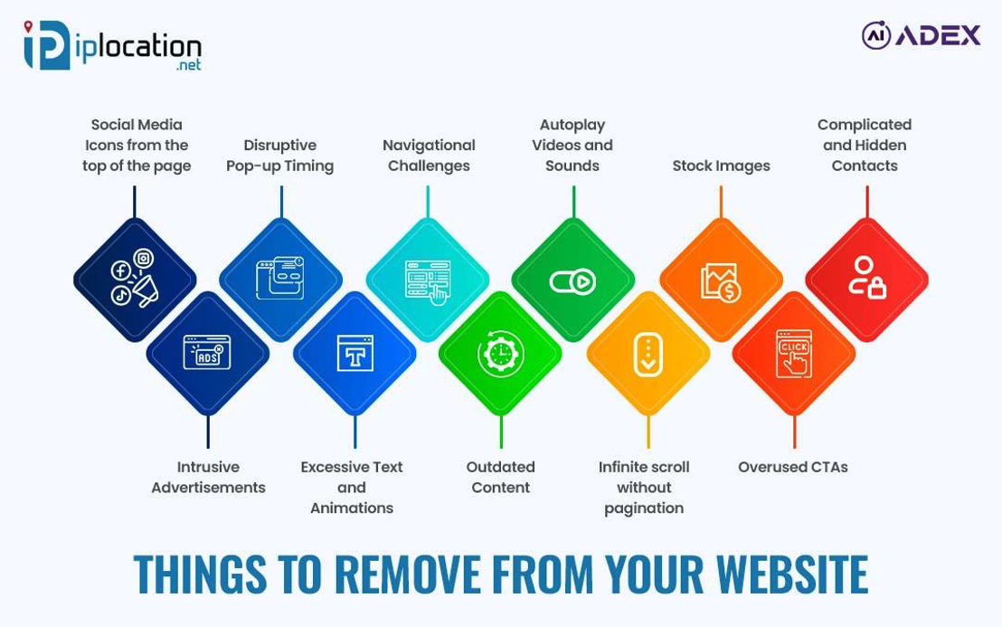
Here is the diagram depicting the common 12 distractions that may steer your visitor's interest elsewhere.

Did you know that moving social icons to the bottom of the page can increase user experience?
Well, there is more. Let's go through an easy go-to to improve your website user engagement by reducing user distractions.
1. Remove Social Media Icons From The Top of the Page
Today, promoting your brand through social media has become essential for boosting engagement and expanding reach. While this strategy is valuable, it’s important to consider the potential drawbacks if not executed wisely.
One critical mistake many website owners make is placing social media icons prominently at the top of their website.
Why Is This a Problem?
Bringing users to your website costs time, effort, and money, whether through paid ads, SEO, or other marketing channels. When you place social media icons at the top of your page, you risk steering these hard-earned visitors away. These icons act as exit doors, tempting users to click away to social platforms where distractions are abundant.
Once they leave, they may forget about your website altogether, reducing engagement, conversions, and ultimately, the return on your investment in bringing them there.
Where Should Social Media Icons Go?
To retain visitor focus, place social media links in less intrusive areas, such as the footer or the Contact Us page. This approach allows visitors to explore your content first and then decide to connect with your social profiles on their terms.
If you operate a blog, consider using social share buttons to encourage engagement with your content. However, keep these buttons minimal and strategically placed to avoid overwhelming users or diverting their attention too soon.
By optimizing the placement of social media icons, you can ensure visitors stay focused on your website’s core value proposition and maximize the returns on your investment.
2. Disruptive Pop-up Timing
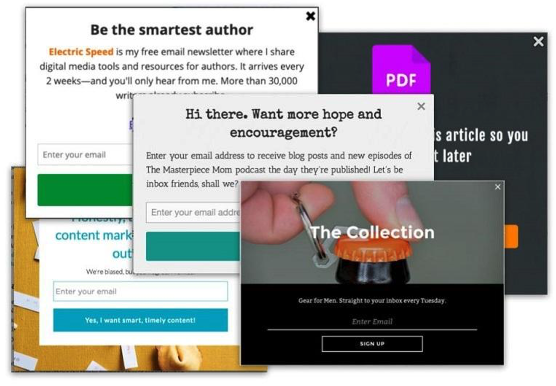
Imagine you're actively engaging with a website's content when a pop-up suddenly appears. Frustrating.
Poorly timed pop-ups are among the biggest obstacles to user engagement. They interrupt the browsing experience, often prompting visitors to leave the website altogether. Research indicates that intrusive pop-ups can increase bounce rates by up to 45%.

That said, pop-ups can be a powerful tool for lead generation—but only when used thoughtfully. Misuse, however, can cause more harm than good.
What Should You Do?
Avoid triggering pop-ups immediately after visitors land on your site. Instead, implement them strategically, such as:
- After users spend time on the page: Allow visitors to engage with your content before displaying a pop-up.
- Exit-intent pop-ups: Use these to capture attention just as a visitor is about to leave.
Additionally, ensure your pop-ups are valuable, easy to close, and optimized for mobile devices. Prioritizing user experience is key to maximizing their effectiveness.
3. Navigational Challenges With Complexity or Absence
Website design goes beyond just aesthetics—it's about guiding users toward meaningful actions. However, a lack of clear navigation or overly complex menus can significantly harm the user experience.
Why Should You Care?
Have you ever walked into a store so cluttered or without navigation that you didn’t know where to start? Unoptimized navigation on a website is no different.
It may cause visitors to experience cognitive overload, leading to indecision and downplaying the website's impression. The impact could be even worse for mobile users—let's not forget that 56.8% of internet users are from mobile devices.
In terms of SEO, this means an increased bounce rate, loss of conversion chances, and loss of trust.
Solution To Navigational Challenges
Ensure your navigation menus are easy to understand, as visitors won't be trying to solve your maze game. Try using simple navigation that provides clarity and enhances usability.
To keep it clean and initiative, keep from 5 to 7 menu keys, and if needed, then use dropdowns for subcategories and highlight core actions.
4. Autoplay Videos and Sounds
Imagine landing on a website and suddenly hearing loud music or an auto-played video. How would that make you feel—annoying, no? That's what visitors would feel, and it distracts them from the main content.
Auto-playing videos and sounds may grab attention but don’t keep users engaged. Instead, they disrupt them and drive them away.
Why Is It A Big No-No?
Since many users prefer to consume website content with mobile devices, auto-play content is startling and often needs to be more welcoming. It spikes bounce rates, let alone the chances of conversion or engagement.
Since Google is concerned about accessibility, the uncomfortable experience for users with hearing impairments or sensory sensitivities could result in penalties.
Should You Completely Remove Auto-play Contents?
You don't necessarily need to remove those altogether. To improve the user experience, you can make them muted yet place visible play buttons and captions to make the content accessible and user-friendly.
When you allow users to play media and choose when to play your video and audio content, you give them a sense of control and decision. Who won't want that?
Last but not least, make your content mobile-friendly to avoid conflicts on smaller screens or mobile browsers.
5. Stock Images Could Be Silently Laying You Off The Game
Visuals like images speak 1,000 words and lay a path to the imagination from their perspective for users- but it stays true unless you are dilating your authenticity with stock images.
Furthermore, if your images take much longer to load, you fuel the fire.
What Is Wrong With Using Stock Images?
Let's leave Google's demands aside. Everyone likes to see authenticity and originality, and you will not provide that essence to visitors with stock images.
There is no denying that stock images are cheap and easy to find—but you are not the only one thinking that. For instance, your website may appear similar to other websites using similar images, and that's not good.
These images may seem generic and sometimes irrelevant to your content, sailing your website into choppy waters. With this comes the SEO game, you know what we mean.
What Do You Need To Do?
The best way to address the drawbacks of stock images is to remove them and invest in professional or branded visuals.
Thinking that's easier said than done? Not entirely. You can use tools like Canva to customize visuals affordably. Also, using stock images sparingly can be a choice, but nothing beats authenticity.
Tip: Remember to optimize image size, format, description, and Alt text.
6. Avoid complex forms and make it easier to contact you
Filling up a lengthy form is boring, and no one wants to spend time doing that. If your website has lengthy forms asking for irrelevant information, then boom, another consumer walked away!
The scenario is similar to the websites with hidden contract information; you are losing potential customers.
Why You Should Not Do That?
Unnecessarily long forms discourage users from signing up. No one is doing those chores here.
Also, if you have been hiding your contact information, it's time to make it visible and easily accessible so that visitors will believe your site's credibility and trustworthiness.
Complex forms lead to abandonment, especially for mobile users. They are also a barrier as they are hard to navigate on small screens.
If visitors are uncomfortable, that bad user experience can turn them away and put them in your competitors' bags.
Keep It Simple
First, make sure that your website's contact information is easily accessible. You can place it in a dedicated section, like a footer. Also, your contacts need to be consistent and accurate.
To simplify form filling, simplify the forms to the essentials and allow auto-filling wherever possible. For example, instead of asking for a full address in a newsletter signup, ask for an email.
An added support chat can improve customer satisfaction and engagement.
7. Excessive And Intrusive Advertisements
Ads are revenue streams, but too many ads can degrade the user experience, potentially affecting future leads and revenues.
Intrusive ads are disruptive and can negatively impact user experience (UX) and, from an SEO perspective, harm a website’s search rankings.
Why Is It Harmful?
When it is excessive, it's not relevant. Bombarding Ads disrupts the content flow and reduces credibility. When advertisements ambush users during their visits, they lose trust in the website, especially when they overshadow the content.
Ad scripts can slow your site, and 53% of users abandon a page that takes over 3 seconds to load.
They often disrupt mobile navigation and reduce content visibility, resulting in visitors skipping the website—some may not even visit it after encountering a bad experience.
Instead, Do This...
First, integrate native ads that blend with your design and place them in non-intrusive areas like the sidebar or footer. If ads are shown within the content, use click-to-reveal ads, where users can engage with it.
Ads should be properly optimized for mobile devices. They should be responsive to screen size and adapt to smartphones and tablets.
To avoid a sense of invasion, ensure the ads are contextual- relevant to the content or audience and distinguishable from the content.
8. Excessive Text/Long Paragraphs And Heavy Animations
Image: You are trying to find information amid walls of text with no hierarchical indications or over-the-top page animations like blinking banners. Did it sound chaotic?
That's what your visitors might feel if your website is cluttered with excessive text and has overloaded pages. It makes it difficult for users to find what they're looking for and buries your SEO efforts.
How Does It Affect SEO?
Google prioritizes high-quality user experiences, and if your website is overwhelmed with excessive text and distracting animations, visitors will have a hard time focusing on your core message and will likely abandon your site quickly.
Also, long text blocks and heavy animations can make your site nearly unreadable on smaller screens, driving away a significant portion of your audience.

In addition, too many elements on a website may slow load times and confuse visitors. If users feel you are not offering helpful information or service, they will……you know what that means.
And after that, you guessed that right: it's an SEO downgrade.
Small Changes For Big Wins
Many SEO experts emphasize simplifying your website—it doesn’t mean dumbing down, but designing with precision and intention to keep pages clean and use whitespace intentionally.
Users tend to scan website content instead of reading every word. To enhance engagement, use animations sparingly and break your content into bite-sized sections with:
- Headings
- Short paragraphs and
- Bullets
To make your content most digestible, add images and infographics for better readability.
An extra add-on could be regular font sizes, which ensure they are legible across all devices and visually soothing website background.
9. Outdated Content
The fast-paced world demands freshness. Old or irrelevant content signals negligence and questions the website's authority and reliability, harming its SEO and visitors' expectations.
Also, stale content fails to capture new search queries or trends, resulting in missed traffic opportunities.
Since search engines prioritize fresh and relevant content, pages with outdated facts or broken links can lose their ranking and visibility.
Outdated? Revamp It!
To avoid trust erosion, conduct regular audits of the website's content to ensure that information, statistics, and links are accurate and satisfy visitors' intent.
Updating old posts/content provides relevance with fresh information and allows you to oversee trends and modify them according to your needs.
Many ask, "What about posts that can not be updated?" First, assess the content's value and align it with current trends; if the answer is "NO," consider removing or archiving it.
If it is not going to do good, it can harm your website in one way or another.
10. Infinite Scroll Without Pagination
The infinite scroll feature has its pros and cons. Content-heavy sites like social platforms may leverage its benefits, but these features are not immune to challenges.
If users want to go to a particular page or review previously viewed content, it may frustrate them and reduce user engagement. It also makes it hard for them to track their progress, impacting overall user satisfaction.
Unless configured correctly, search engines can not crawl and index all dynamically loaded content, which can reduce search engine visibility and traffic.
What To Do?
Ensuring that the infinite scroll implemented is SEO-friendly and user-friendly is essential to mitigate these issues.
Using the History API to update URLs dynamically, lazy loading content, and combining infinite scroll with traditional pagination as a fallback can help search engines crawl and index the content correctly.
Optimizing infinite scrolls for mobile devices and limiting the number of items loaded at once can improve the user experience and avoid performance issues, ultimately helping SEO and engagement.
11. Poorly Designed or Overused CTAs
Weak or confusing Call-to-Action (CTA) buttons can interrupt your website’s flow and hurt conversions. Users may feel lost if the CTAs are vague, resulting in confusion and decision fatigue.
On the other hand, bombarding users with multiple options can also overwhelm them. As a result, the site’s effectiveness is diluted, leading visitors to disengage rather than take action.
What Does This Mean In SEO?
In SEO terms, users getting annoyed and leaving websites means the likelihood of high bounce rates- the metric search engines use to gauge whether your content is valuable.
What Is The Remedy?
The solution lies in simplicity and clarity: streamline CTAs that are clear, compelling, and relevant to the user. Focus on one primary CTA that aligns perfectly with the page’s purpose, but keep secondary CTAs complimentary if necessary.
Testing different variations of CTA copy, design, and placement through A/B testing can help identify what resonates best with your audience and improve conversion rates.
Clarifying your goals to the visitor maximizes engagement and user experience, which is a win-win for your site and visitors.
12. Overdloaded Sidebars
Sidebars help websites by providing navigation and supplementing content or promotional material for visitors. However, if you pack them with ads, widgets, and too many elements, there is a hidden cost—visitors may leave without interacting with your content.
Clutter and Distractions Are Demotivators
With loads of ads, widgets, social feeds, and who-knows-what-else competing for attention on the website, visitors may need help to focus on the content and bounce off your site. A visually cluttered interface may disrupt your website's harmony and undermine your site’s professionalism.
It hurts mobile usability as they might push essential elements or overlap with others. Also, overloaded sidebars may dilute the power of your CTAs amid the noise.
Think Like A Visitor And Note Your Expectations
Since your website’s primary purpose is to serve others, you need to consider how visitors might interact and their preferences. You are probably not staying on a website with a sidebar crowded with 15 links. Do you feel that?
First, prioritize your content and reduce redundancy on sidebars—essentially repeating the same content in different formats. Keep it clean, highlighting one or two primary goals only.
For better performance, you can use A/B testing to determine which elements in your sidebar resonate most with your audience and test their usability on mobile devices for optimization.
Conclusion
If your site is cramped with distractions, outdated content, or poorly placed elements, you risk losing valuable traffic and potential customers—eventually, revenue.
Thinking of action but afraid to take it? The path to a better user experience, increased conversions, and improved SEO is simpler than you think.
You can enhance usability, improve engagement, and align with SEO best practices with a well-curated website design and strategic removal of noise—whether excessive animations, lengthy text, intrusive pop-ups, or misplaced social icons.
What happens from this small change? A boost in engagement, a drop in bounce rates, and a rise in conversions.
Optimize your website now! Give visitors what they expect from you: a simple, efficient, valuable, and worthwhile experience.
Share this post
Leave a comment
All comments are moderated. Spammy and bot submitted comments are deleted. Please submit the comments that are helpful to others, and we'll approve your comments. A comment that includes outbound link will only be approved if the content is relevant to the topic, and has some value to our readers.


Comments (0)
No comment